
How Do I Choose Responsive Banner Images?
Responsive websites are crucial to your business since being 'responsive' means that no matter what device or size of screen your website will always be visible and usable.
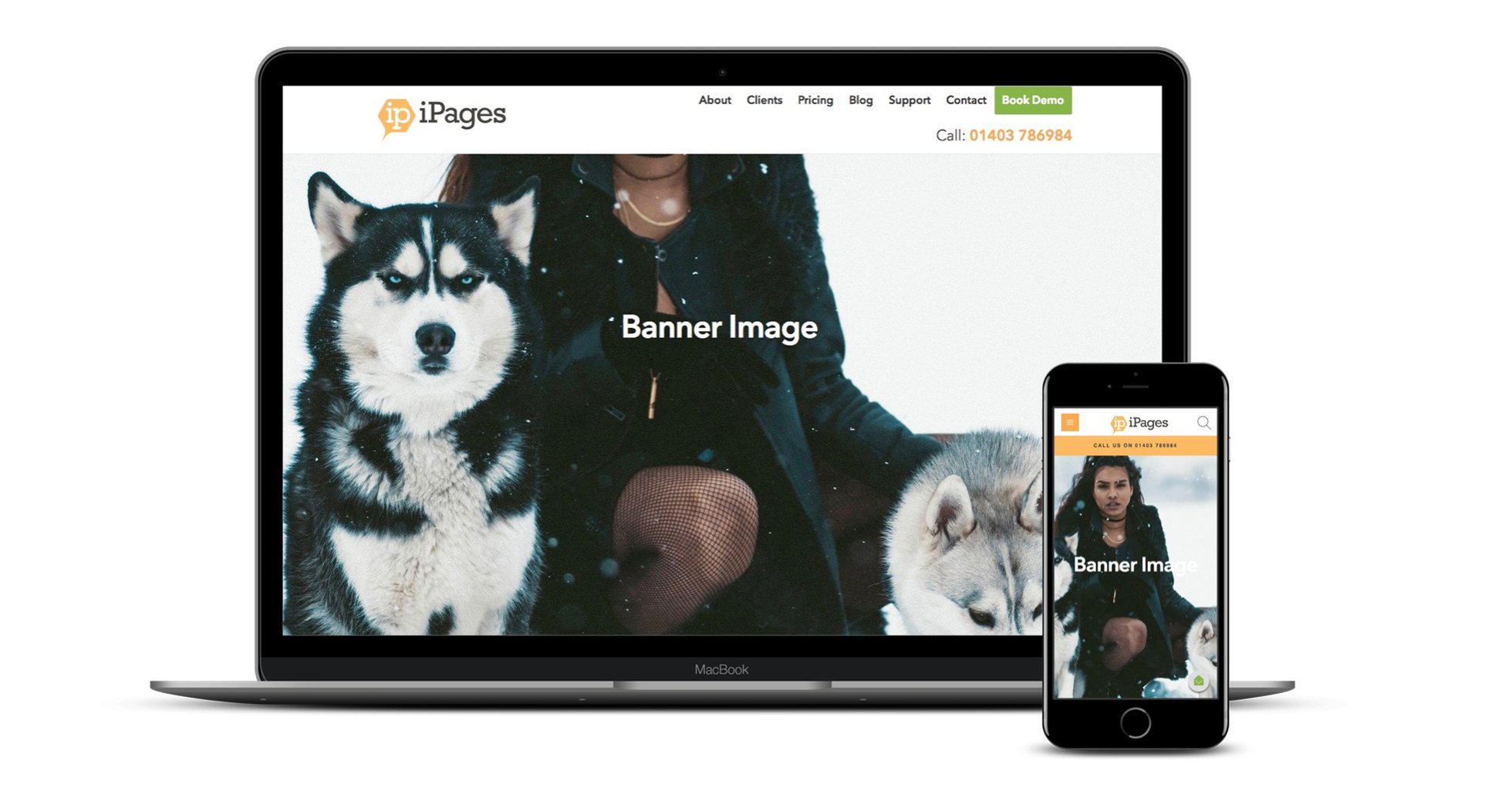
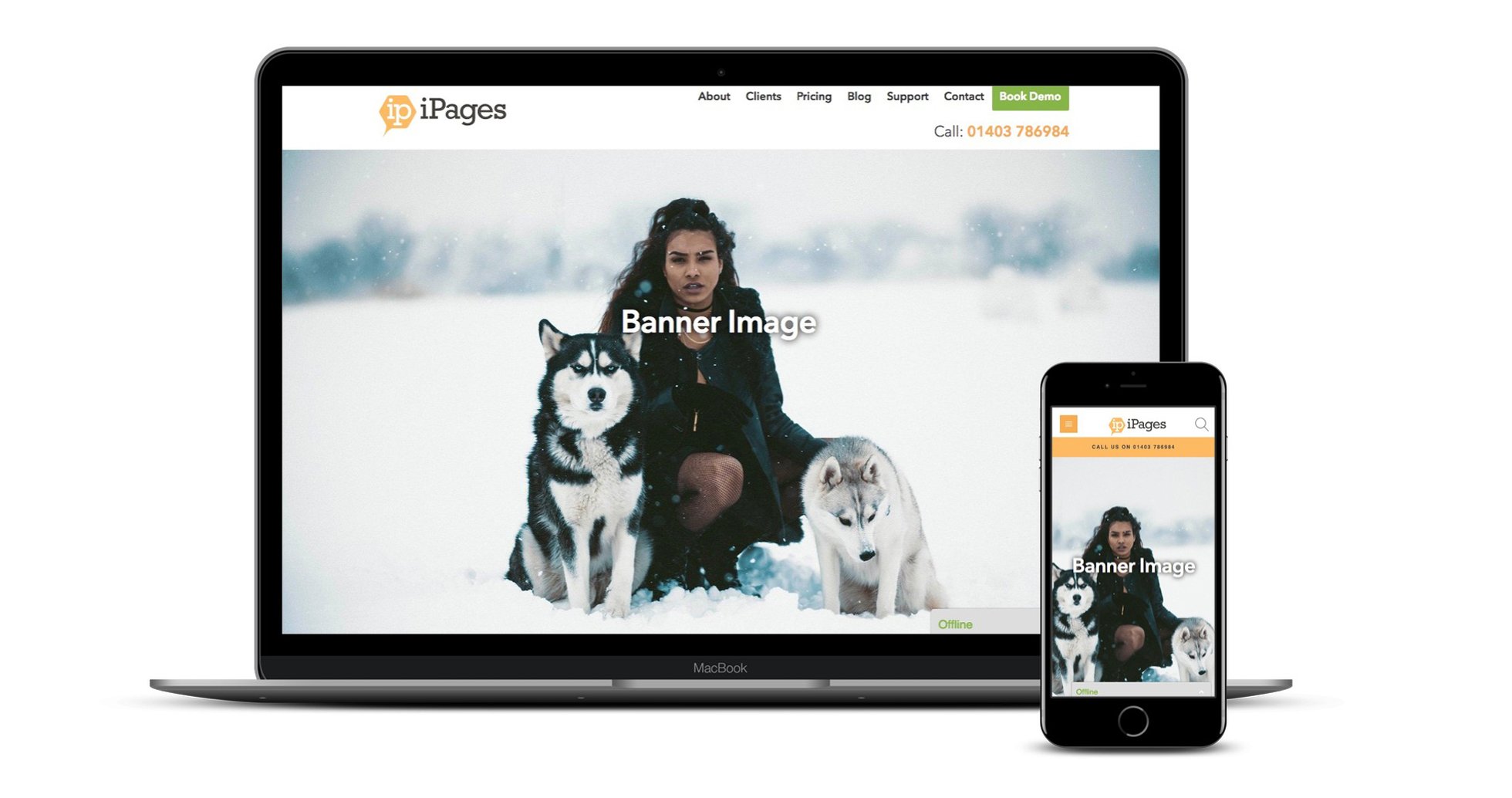
It's essential to get the images right on your website because they primarily engage your web visitor whilst defining and communicating your brand identity. It can be particularly difficult to find images which work responsively and view correctly on all devices because parts of the image can be cropped depending on the screen size. In this example, the woman has an unfortunate case of decapitation on the laptop while her poor pooches are getting a similar treatment on a mobile.
Why and how does this happen? To understand this, it's good to first understand what it means for your website to be responsive.
Responsive websites 'shrink' the dimensions of your website horizontally re-positioning everything on your site. This is known as a fluid or responsive layout. Therefore a main banner needs to work both on a wide landscape view and on a narrow portrait view, not an easy feat.
Here's our 5 tips to help you choose banner images which work.
1. Make sure your image is large enough
We recommend using an image which is a minimum of 1980px wide and of a depth of at least 900px (but ideally 1300px). Smaller images than this will result in blurry images on certain devices.
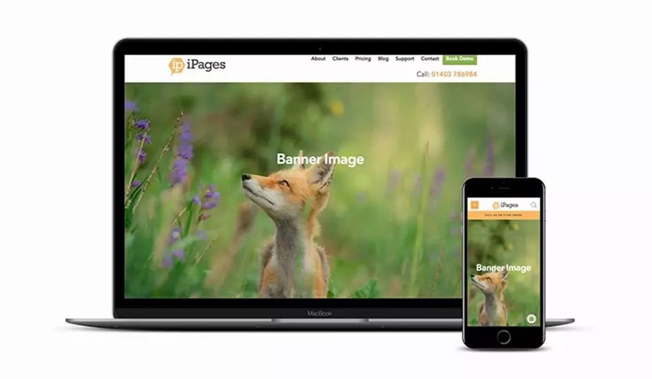
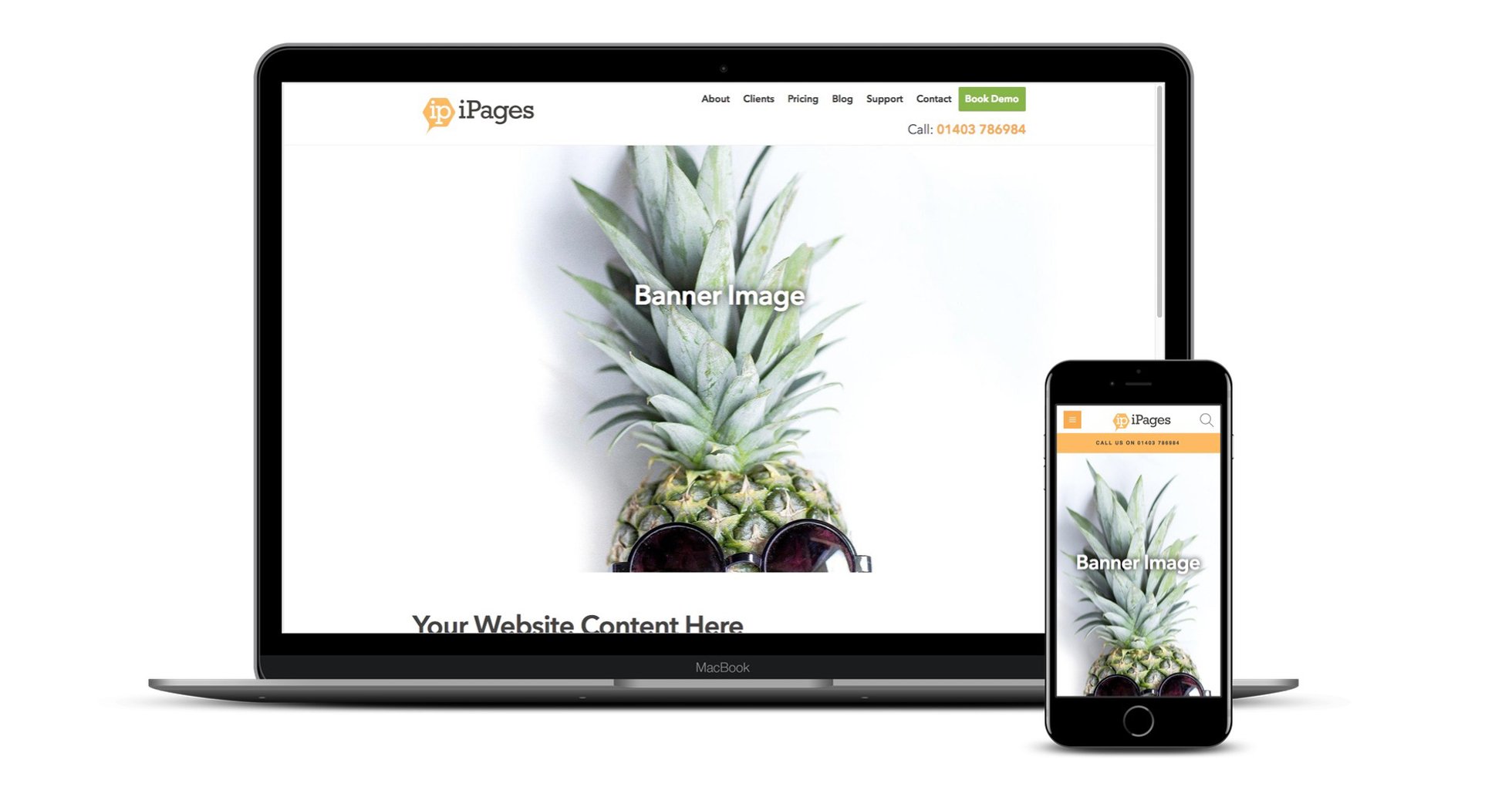
2. Choose an image with a central focus and space around it.
Let's say you have a banner with a person or object in it, it is very important to keep the main focus in the centre of the image with enough space around it. Since responsive banner images are displayed in a portrait format on the phone compared to a landscape format on a desktop, the left and right of the image will be cut off on the phone, and equally the top and bottom of an image can be cut off on desktop. Therefore only the central area is visible on all devices.
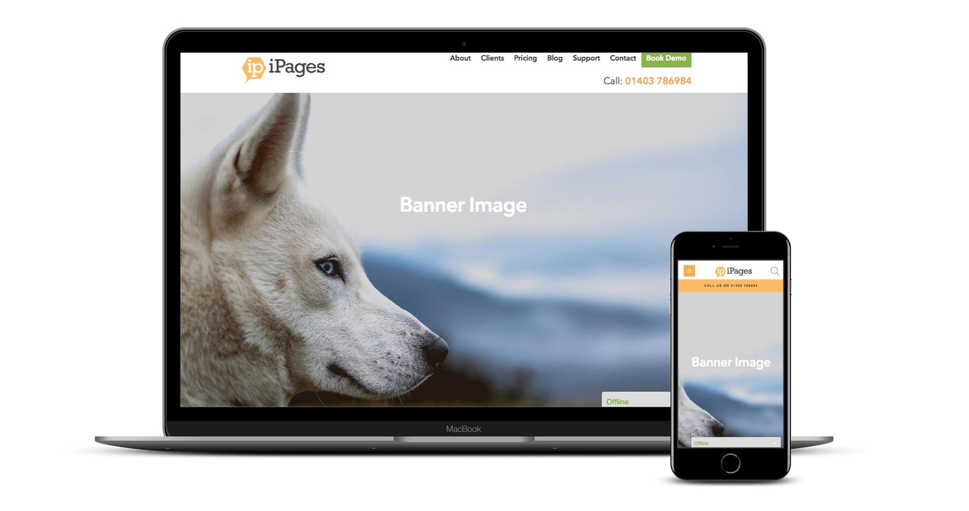
For example, this image has the dog more to the left of the image, which means that on mobile all you can see is a small bit of nose.
However, in this image the fox is placed more centrally with lots of space to the left, right, top and bottom, which means the fox is visible on desktop, on mobile and all the possible sizes of screen in between.
Let's return to my example earlier of the woman with her dogs.
Here's the image before I placed it in the banner where you can see the woman's face is towards the top of the image and there is little space to the left or right of the dogs:
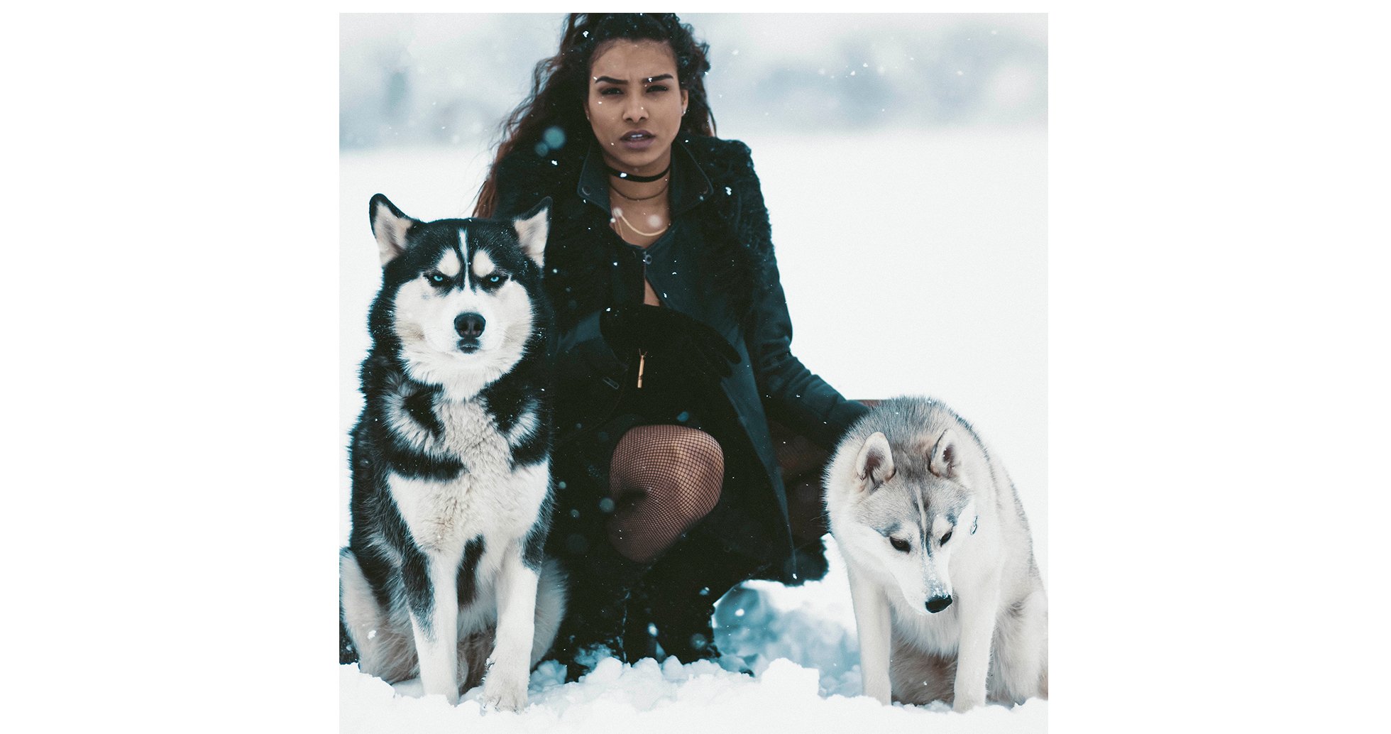
And again when it's placed in the main banner the woman's head is chopped off on the desktop as the image is placed full width across the screen. On mobile the dogs are chopped off on the left and right on mobile because the image is placed at full height.
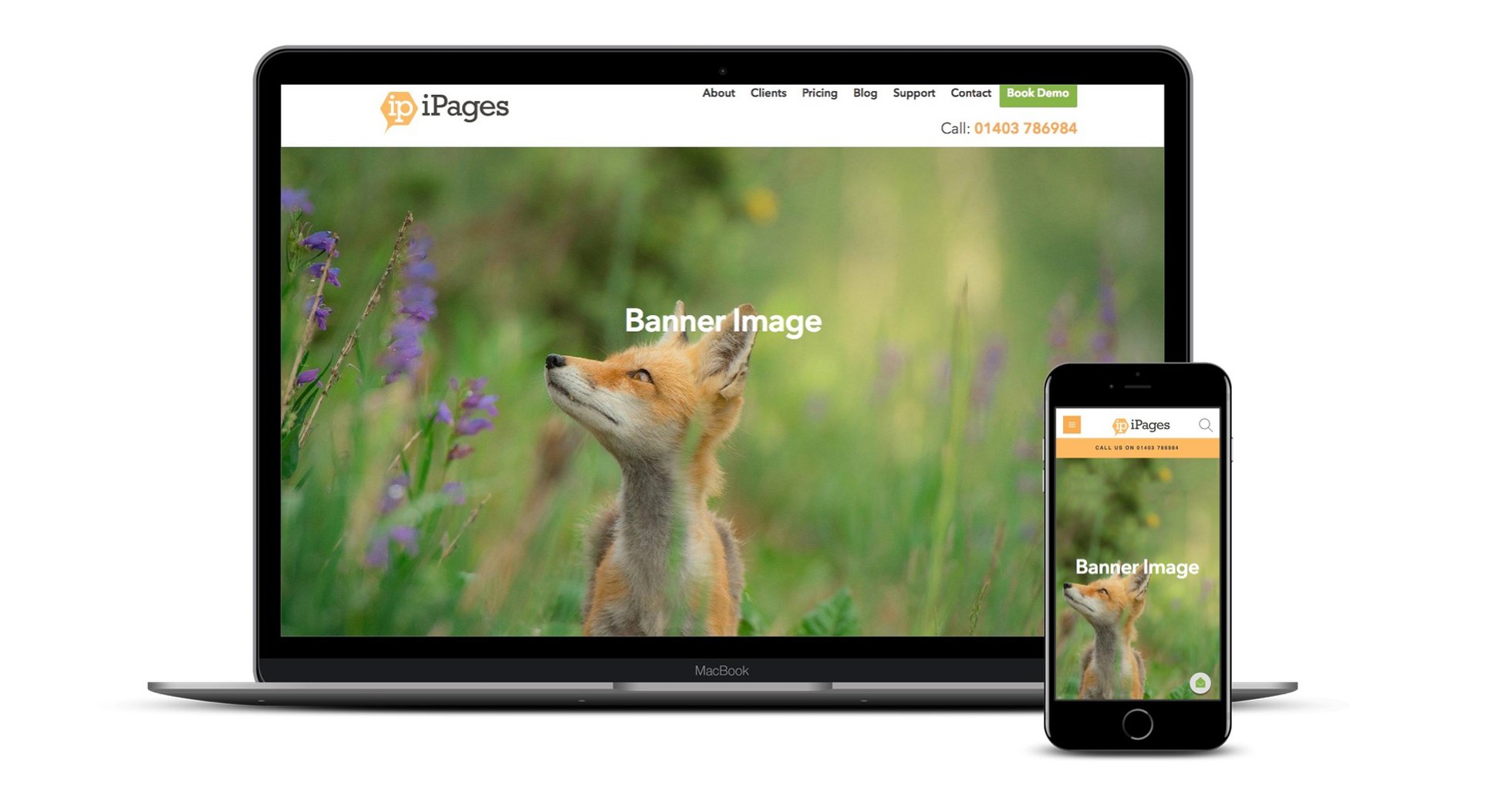
Let's take another instance of the same image but this time with plenty of space around the main focus. First here's the image before it's placed in the banner:
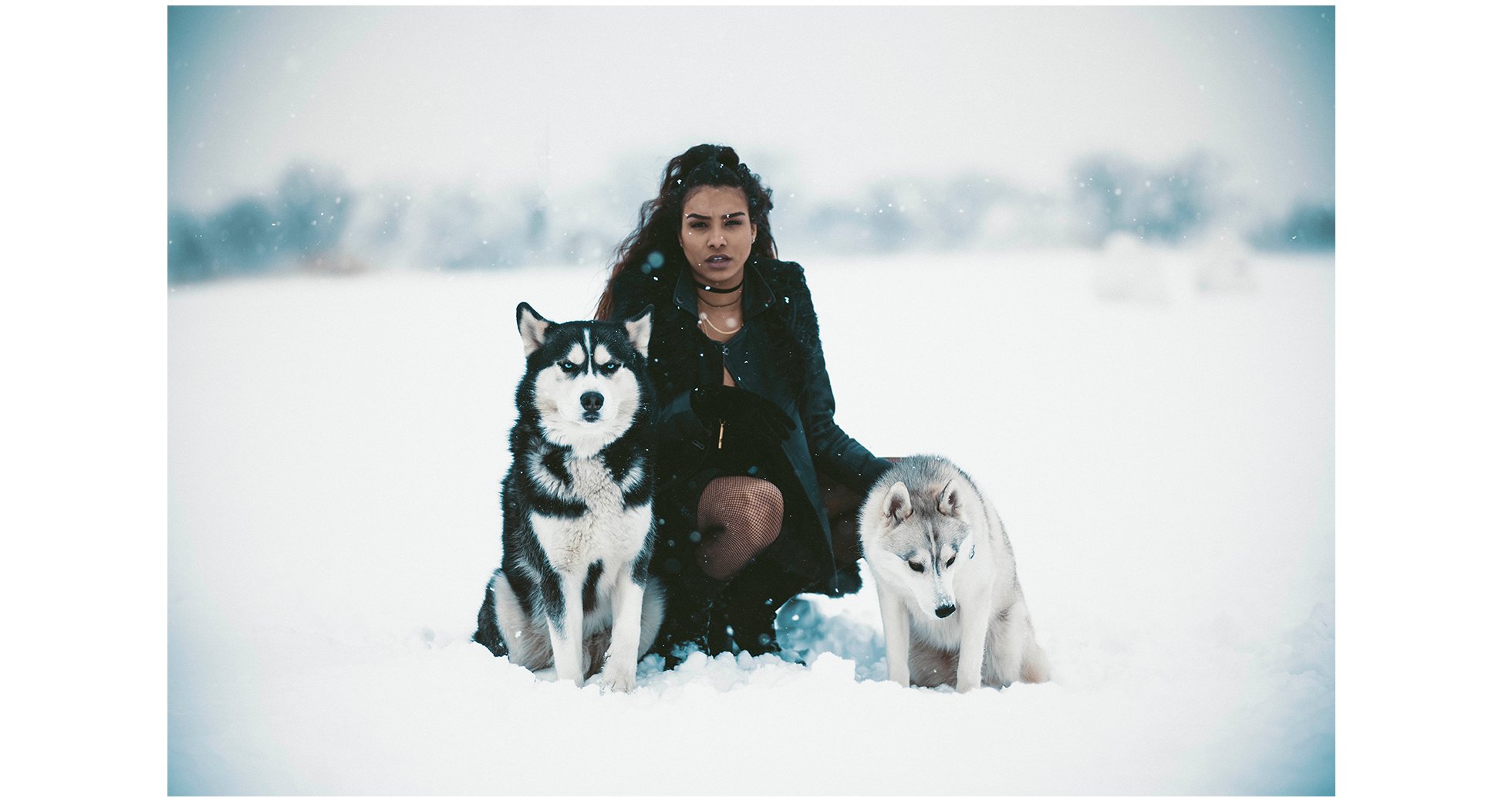
And here it is placed in the banner where you can see the woman and her dogs are clearly visible on both mobile and desktop.
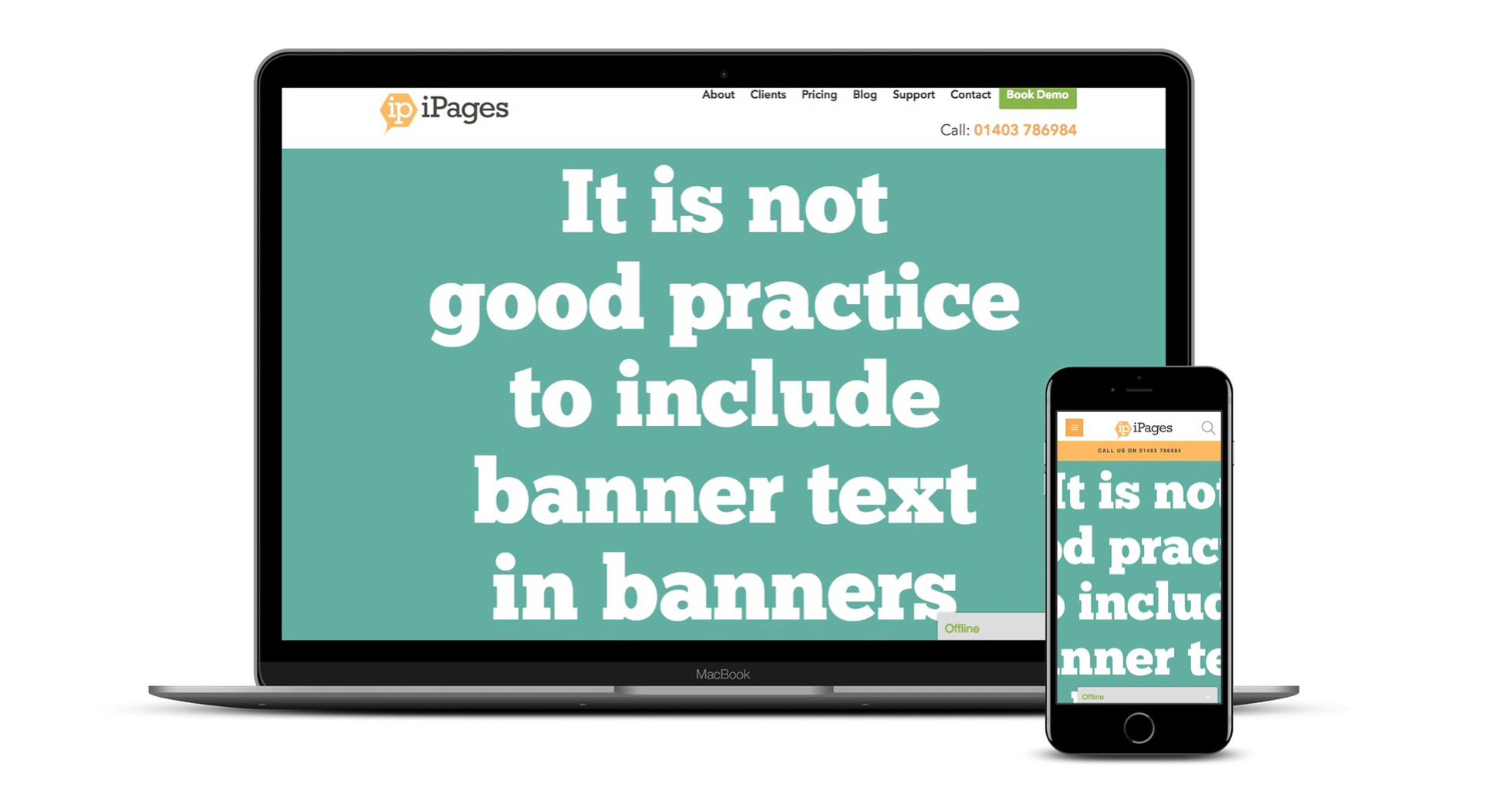
3. Try not to include text in your image.
Having text as part of the image is not a good idea because:
- it's likely to look broken on some devices.
- text within an image cannot be crawled by search engines such as Google, and
- text can easily weaken your brand without a consistent approach to font, placing, sizing etc. because it weakens trust in the site which could lead to your site resulting in less conversions. An example is here of how a banner which views well on desktop then breaks on mobile. If the text includes a call to action or something informative, it's particularly important that it views well on all devices.
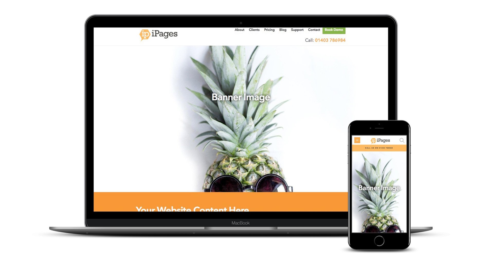
4. Don't choose a banner with the same colour background as your site.
Let's look at the example below. The banner looks broken as the eye doesn't know where the image ends and the background begins because the image bleeds into the rest of the site content. In the next example, the background of the site is bright orange so you can see the difference between the banner image and the rest of the site content which makes everything clearer.
5. Finally test your images in your site.
And finally test your new banners on as many devices as you can lay your hands on. If you don't have a number of different devices handy, there is a feature in most browsers to view what the site will look like responsively and the browser will give a rough approximation of your website on various devices. A quick trip to Google with a search of 'how to enable responsive design view in (enter browser name)' will bring up the latest information on how to enable this feature in your browser.
We hope you find these tips useful. Please do get in touch if there is anything else we can help you with.