How is website photography different to photographing for print?
We are supporting an increasingly large amount of our clients with website photography by our very own Creative Director, Emma Simpson.
Emma has a background in consumer magazines and advertising with years of experience directing photo shoots for many different brands and demographics so it seemed fitting to share that experience with our clients.
In this blog, Emma writes about some recent shoots she's been on and shares about the differences when you are shooting for web versus shooting for print.
How is shooting for web different from shooting for print?
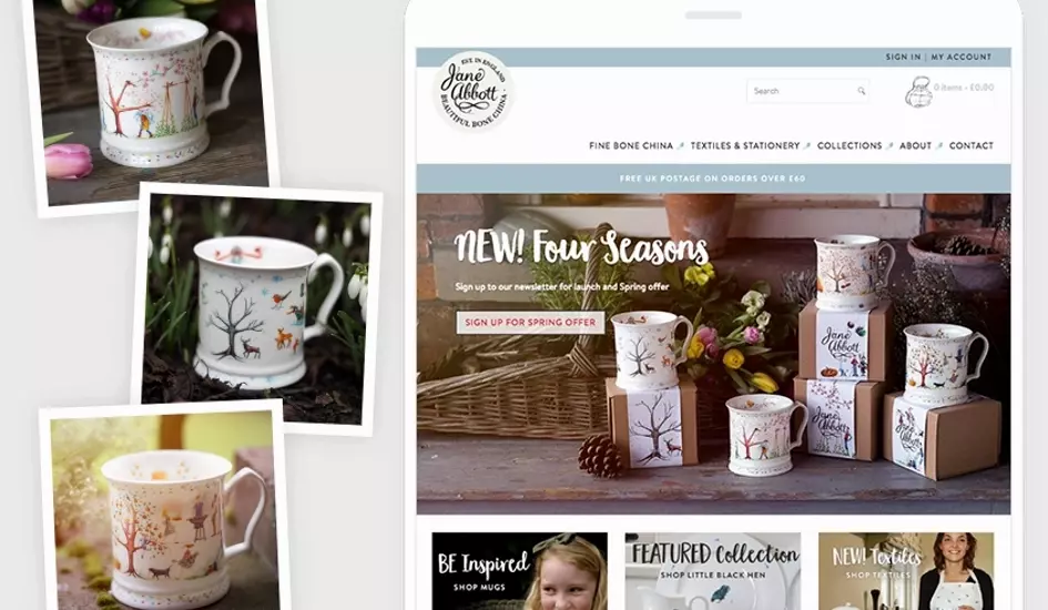
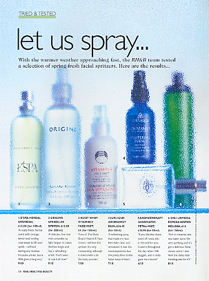
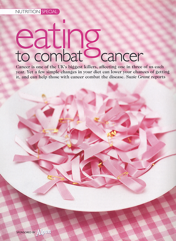
In many ways shooting for the web is no different to shooting for print. It's mostly just a case of giving different consideration to how a shot is composed. When shooting for print, the dimensions are usually known for the image and everything remains a fixed size so it is easier to control exactly where the text will sit. It's also easier to control the colour although the limitations of cmyk printing (as opposed to the rgb colour space on the web) mean that I tend to be careful when shooting oranges particularly and whites since these can appear dirty in print. However, on the web although the colours look cleaner and brighter, sometimes detail is lost in the resolution and a single image often has to work at a variety of screen sizes from desktop to mobile. For example the two print shoots I directed below, 'let us spray...' and 'eating for cancer' were shot in portrait format with clear space left for headlines and text which are then placed on the image in the design process before printing and I could control very precisely exactly where each piece of text sat. However, for the web banner I shot for Jane Abbott, I shot in landscape format which is usual for web and I left space to the top left for the headlines and button. However, this text and button is put on with html type and moves around on the image dependent on the screen size so it's not possible to control so precisely where the text sits on the image although my experience with building websites means I know how and where this type tends to move so it's possible for me to compose the shot with this in mind.
What recent shoots have you been on?
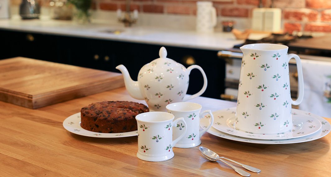
Jane Abbott Designs
Her most recent work was collaborating with Jane Abbott who designs and creates her own fine china and has both a consumer and wholesale website with iPages.
Emma said the following: "I loved having the opportunity to collaborate with Jane to showcase her new Four Seasons collection as I love her work and she also has a background in design with a great eye for detail which made working together fantastic.
We took the products outside and let the environment provide much of the styling. Jane knew some good spots local to her and there were a few times when I found myself flat out in the snow and mud trying to get the perfect angle. I find I get so involved in shooting that I really don't realise the cold or any other distractions and it was only when Jane told me that my lips were actually blue that we thought we ought to head back inside and warm up by her Aga with cups of tea. It's so important that everything within an image reflects the brand and to think about the lighting, the styling, the angle and the content.
For this collection, we kept things very simple with natural light, using very few props and let the environment provide much of the styling. I did some design work some years ago for Country Living and they and Jane share a similar customer/reader and it was this I tried to keep in mind when taking every shot."
MC Designers/Tate Britain
As well as product photography, we have also shot a number of exhibition spaces for our client, MC Designers at Tate Britain including the Turner Prize, the Hockney exhibition, and Cerith Wyn Evans.